10 Examples Of Ecommerce Navigation That Can Improve Sales
Category : Newupdates and Blog
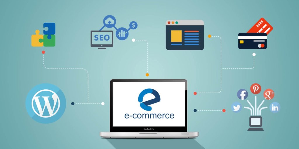
Navigating your way to more online sales
Recent reports revealed that e-commerce Amazon has, for a couple of years running, spent a staggering 97% of its marketing budget on search advertising. Although most companies wouldn’t be able to afford the $1.35 billion that Amazon spent on search advertising in 2015, the internet giant is not alone in prioritisng this area. In 2017, companies worldwide spent $95 billion. Although improving on the searches that lead customers to your site is undoubtedly important, it’s all academic if you then lose those customers due to bad site navigation. As search optimisation experts in Leeds, ExciteBrand knows site navigation like the back of its hand. Experts on web development, SEO and e-commerce, ExciteBrand say that common navigation issues include customers failing to find what they’re looking for, confusion as to which category a product will be listed under and, complicated checkout procedures. ExciteBrand have provided the following guide to 10 examples of good site navigation which will help keep your customers on your site – and clicking through to the checkout.
1. Autocomplete By Waterstones
Popular book store, Waterstones, makes great use of the autocomplete suggestion tool. Waterstones autocomplete provides accurate suggestions with as little as one word entered into the search bar. Not only that, but the suggestions are accompanied by thumbnails of the book cover – perfect for those bookstore customers stating, ‘I don’t remember the full name but, the cover was red!’. Take a leaf out of Waterstones’ book and make the most of this handy tool in order to make sure your customers find what they’re looking for quickly and easily.
2. Rollie Nation’s Faceted Search
Online shoe store, Rollie Nation, uses the hugely popular faceted search method on its website, cutting out time wasted scrolling through irrelevant products. A faceted search is one where a customer begins with a simple search, for example, ‘ankle boot’ and is then given options to narrow the search by colour, size and fabric. Used widely in the fashion industry, faceted search options are proven to keep customers on a site.
3. Bigger, Aesthetically Pleasing Navigation Menu By Big Chill
Used to great effect by Big Chill, a clearly marked and simply designed navigation bar is preferred by most customers to more elaborate methods. Most customers want to get onto your site, find what they want and seal the deal quickly so a minimalist navigation works wonders.
4. Repeated Subcategories Under Different Parent Categories By Best Buy
On its website, Best Buy uses duplicate subcategories for each, separate, parent category. The benefit here is that customers get to recognise the subcategories no matter what they’re browsing and, therefore, have a quicker and easier navigation experience.
5. Fun Animation By Skinny Ties
As enjoyed by Skinny Ties’ online customers, colourful and fun animation can be used to great effect for site navigation. Animation can even help to improve SEO by cleverly combining animation and keywords.
6. Asos’s Cookie Retargeting
Clever cookie retargeting is a great way of making sure that customers come back to your site time and time again. Asos is a great example whereby customers are automatically directed to their relevant section, such as womenswear or accessories.
7. Easily Visible Searching Options By Zara
Clothing brand, Zara, has incorporated a highly visible and easy search option onto its website to make sure that customers find what they want quickly and easily. As a customer begins to search, full sized images of relevant images immediately appear, allowing for super-easy browsing.
8. Mountain Bikes Direct’s Benefit Bar
Increasingly popular with online customers, a benefit bar can serve a dual purpose of advertising special offers as well as listing trusted partners and suppliers. When visiting a website, the eye automatically goes to the top of the screen so a benefit bar is a great way to display important information.
9. Feature-Rich Drop-Down Menu On The New Balance Site
Images, information and product names all help to make life easier for the customer – New Balance does this well with its top navigation menu which displays a full product image, product name and other useful information.
-
One Click Purchasing by Amazon
It’s easy to see how this one can benefit a business. Amazon account holders, having found the product they require, are often given the option to purchase with one click instead of being processed through the checkout system. This system increases sales by removing the ‘cooling down period’ that a customer may experience whilst checking out.
Search optimisation experts in Leeds, ExciteBrand, can help to streamline your business’s navigation in order to improve customer experience and, of course, to increase sales.